Freezing rain has kept me housebound the past two days.
This means I have had a few extra moments to ponder and mull, research and react, and enjoy a bit of millinery too.
First up:
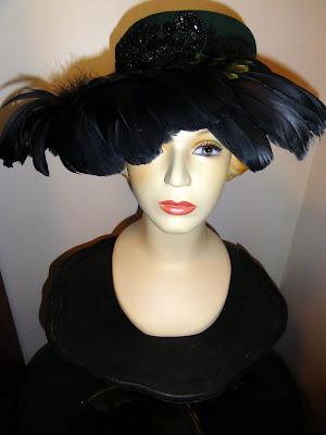
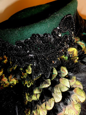
After doing a little research, I am excited that I will be wearing this hat again!
I have a matching emerald green long shawl collar wool dress coat; I haven't worn them in ages because somehow emerald green just seemed, oh, I don't know, just kinda not right.
After doing a little research, I am excited that I will be wearing this hat again!
I have a matching emerald green long shawl collar wool dress coat; I haven't worn them in ages because somehow emerald green just seemed, oh, I don't know, just kinda not right.
Are you up to speed with Pantone's announcement about the color for 2013?
I wasn't until two days ago.
I did know that two years ago Pantone named a color called Honeysuckle for the color of the year, which was a coral pink punch color.
Last year it was an aqua shade...
I really didn't expect them to name EMERALD to be the color for 2013.
How could I have missed guessing that Emerald would be making a comeback in our color choices?
Now if you were old enough to buy furniture back sometime around in 1985-1995 I am almost willing to bet that you probably indulged in a sofa with some emerald or hunter green colors, probably mixed with a deep wine red or burgundy, or perhaps a deep royal blue.
There's a reason why I can make this guess.
As it turns out, color choices rotate in ten year cycles, usually beginning the shift about mid decade.
The cycles go from:
Subdued/Pastel
to
Saturated/jewel tones
to
Earth tones/Neutrals.
From 2003 to 2013 we have been trending towards neutrals and earth tones.
Think granite counter tops, coffee brown woods, or birch, or steel greys, with accents of nature tones of aqua or natural greens, or wheat golds.
I posted about the history of color cycles before HERE,
The pastel pink, yellow and baby blues of the 1950-60's
The saturated pop "hot" lime/pink/orange colors of the 1960-70s,
The earthy harvest gold/avocado/copper/macrame earth tones of the 1970-80s,
The pastel dusty blues and mauves pastels of the 1980-90s,
The jeweled hunter/burgundy/navys of the 1990s-2000,
The neutral earth tones of mossy/cream/coffee black earth tones of 2000-2010
Then we drifted quickly though a pastel aqua/greys/light blues the past three years.
Now, in a speeded up cycle, we are just starting to see the first hints of back to jewel tones.
Emerald green will now be showing up everywhere.
Paint a wall emerald green?
Carry an emerald green purse?
Wear an emerald green blouse?
Buy an emerald green accent pillow?
Now is the time!
At first I was a bit disappointed that the color that will be "out there" was emerald green since it was a been there-done that color for me.
But after looking at photo examples of emerald green in home decoration and wardrobe accessories, I have emotionally bought in.
Again.

It is quite a daring hat...
(And I should have used a diffuser on the flash to avoid that heavy back shadow...a piece of tissue wetted and stuck to the flash usually will do the trick...)

As has our master bedroom.
The trouble is...I don't like the cameo pink color.
I wasn't sure of it when I first painted it four years ago when I was trying to fit into the the Mid Century modern vibe.

After flirting with painting the walls a deep brown, or a celery green I have finally decided what color I am going to go with:
SW Dover White.
A basic creamy white.
How...uh...not daring.
Not jewel toned.
(Although I do think one friend's nearly emerald green guest room with periwinkle accents is awesome...hi Ellen!)
Big paint project coming up soon.

A passing note: Are primroses showing up in your supermarkets now?
Ours all have potted primroses in all sorts of colors, two for $5.
I am stocking up...they are such a cheery little inside plant.
After the blooms fade I stick them outside and later plant them in the garden where they seem to come back and bloom nearly year around.
Such a deal!

Last discussion point:
How often do you read booklets or instruction guides that come with things?
My tripod came with just a hang tag with a few specifications listed.
I was hoping for a guide book of some sort but no, all there was was the hang tag.
Yesterday, being house bound, I took a moment to read what little the hang tag had to say.

This line stopped me dead in my tracks:
The tripod had a Removable platform for reverse mounting for copy and micro photography.
Huh???
No additional information was included.
I went on line to the Sunpack website; no additional information was there about how to reverse a mounting.
Eventually I saw a picture of a tripod set up in a reverse platform mount; it looked something like this:

Whoa!
Game changer!!!
I consulted with the ever patient engineering minded Mr. B. and he soon configured my new tripod in a reverse mount position.

The camera was now upside down.
The display screen was right side up though.
I got a mirror to slide under the camera to help me see the dials for the various camera settings.
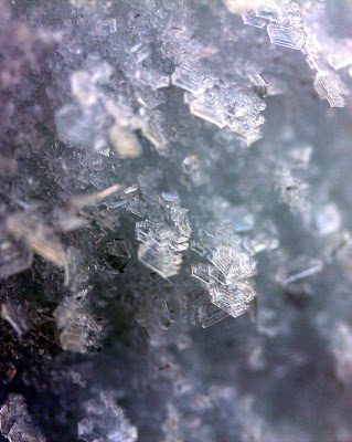
Moments later I was taking macro shots on manual, with longer time exposures that require tripod steadiness.
I am so glad for once I actually read the materials that came with a purchase!
My Christmas tree stand McGyver project will still be used for fast shooting.
But I am sure that this tripod function will get its use too for macro work with flowers and ground items come later in this year.
Long post.
Hope you found something here that made it worthwhile to read!


