
Yup, that's me in Daisetta Texas, home of the giant sink hole posing next to the yellow DO NOT CROSS POLICE LINE tape.
Daisetta Texas, where it was as hot as heck and where I had hoped to get a glimpse of the giant sink hole that has been so much seen on the news lately.
Lovely town....
Bernie and I headed out to Daisetta around 3:30 pm on Friday. It was a pleasant hour long drive through the country. Having a GPS guide us through the various highways and biways was most helpful.
When we pulled into Diasetta city limits, we realized that this was a really, really small town.
Population 1023 if I remember right.
The main street, named Main Street, was closed to through traffic, so we parked beside several other vehicles in an unpaved parking lot and wandered across the road to where all the television trucks were already parked.
Every sort of official vehicle was parked at various angles on the street.
Police, fire, rescue, Texas railroad commission...
That last one really made me curious.
(Bernie's ahead of me in that last shot, in the white shirt, walking along with his hands stuffed in his short's pockets.)
A quasi command station had been set up in the middle of the road.
I'm not sure what coded messages were being posted there, but everyone seemed rather laid back and calm. Right behind that booth was another tented area with stacks of water bottles, table, and several barbecue smokers.
Hmmm....a nice barbecue dinner sounded like a lovely option for sink hole viewing apres activities.
In front of the white board command center a small crowd had gathered; a group of about 20 people. They began to walk down the road in a tight group, lead by an official looking person in a uniform. Bernie and I picked up the pace and caught up with them, assuming that they were headed to the crater.
The officer stopped on the grass about a block down the road. We crowded around him expecting some kind of address. You can see the tape blocked road leading to the crater in the picture above.
I thought maybe I could get a better picture by walking down to the opening of the dirt road.
I walked a few feet that way. The officer spoke up and told me I wasn't to stand there.
Okay.
I walked back to the crowd.
I really couldn't see much. A tanker truck came driving up the dirt road and stopped. Bernie commented that the tanker must weigh a lot more than all of us, and why couldn't we step up on the curb to see better.
A guy in the crowd turned to Bernie and said "You aren't from around here are you?"
Bernie allowed that no, we were not.
The local informed Bernie that the town's officer needed very little to arrest anyone and lock them up for 48 hours, no questions asked.
Now there's Southern hospitality for ya.
The officer didn't speak again except to warn everyone to stay back.
EVERYONE was standing in the road; the yellow police tape was at least ten feet away.
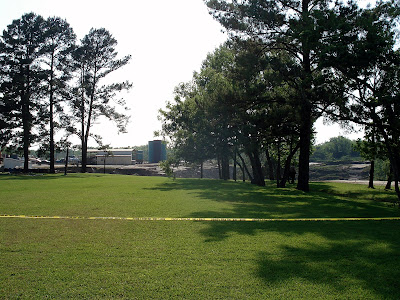
I really wanted a good view of the sink hole. I walked back up the road to a place where I could see between the trees. The edge of the crater was just barely visible. I took a shot.
Notice where the police tape is.
I decided to continue walking back to the command center, and the view was a tad better from there. I stepped up onto the lawn, noting that there was a couple of people standing in the trees looking out over the sink hole. I was about three feet from the curb, which gave me an extra 8 inch or so of altitude.
I've zoomed in on this shot and cropped out the police tape.
See the two guys in the trees? The blur in the sky is the news helicopter that had been continuously circling the sink hole since we first arrived in the area.
It was at that point I heard the officer say "Lady, I'm going to ask that you be escorted out of the area."
Huh?
I looked around to see who he was talking to.
Um...that apparently would be me.
I stepped back and a police woman came right up beside me. "Escort her out of the area" the office said again. I was gently herded over to this vehicle:
Now picture this: Here I am, dressed in a nice sky blue knee length skirt, white tank top, white belt, a scarf around my neck and I am carrying my open parasol.
The police woman barely comes up to my shoulders.
"Ah, Bernie?" I called out.
"Yeah?"
"Hon, they want to escort me out of here."
Bernie loped over.
"Can I go with her?"
The police woman made eye contact with the officer.
"No."
"Can we just walk out of here by ourselves?"
A moment hesitation, then a hesitant "OK" was heard.
Whew!
My little drama seemed to put an end to the tour opportunity. Everyone began to drift back down the street, grumbling about the ultra controlling officials.
Various news cameras had tagged along, and I watched as the more "folksy" and colorful characters got singled out for an interview.
Don't you think they missed a great opportunity to interview little ol' me and the police harassment that I had suffered?
I spun my parasol lazily as I walked, careful not to walk too fast or too slow.
Just real casual like.
We walked pass this scene with a deep hole at the base of a pole? Another sink hole?
No, a local informed me. It was Liberty counties (censored) idea of a drainage ditch.
Oh. Apparently most of the folks were not overly fond of the local government.
I paused to watch the ABC news guy practice his report, barely audible over the roar of the helicopter overhead. I did catch that the town was asking the governor of Texas to declare the town a disaster area.
Not to be unkind...there's not a lot to the town to begin with. Lots of boarded up buildings and such...
The news truck parked on a lot on
Main Street.
Our car...and another Main Street building.
Maybe the sink hole would be like the old joke about Alabama hurricane damage:
It did a half million dollars worth of improvements to the area.
I never thought of myself as a rabble rouser, or as person that would ever be needed to be run out of a town via police escort.
Secretly I almost hoped I could have gotten the ride. I've never have had a ride in a police car before. And as Laura always says: If you are ever in a police car or an ambulance, ask that they turn on the siren. Get the whole experience, get all the bells and whistles!
Now I will always wonder what could have happened it I had gotten in the car and asked for the siren to wail.
Maybe me and my parasol would have made national news!
Bernie and I headed out of town after that.
I tried to think who I could of called to make bail for us if we had been locked up.
That is the problem with not having very many face-to-face friends.
Gail said she would have wired me bail money.
She is a really good friend. In fact she said she would of wished that she could have been there in there with me!
Now here's be the best two parts:
A
video with the law enforcement officer (
Hu8
gh B8
ishop) who booted me out of the area.
And better....
This
video of the man talking to
MSNBC.
Oh my!


